

Overview01 / 13
A venue built as a feeling.Then given a look.
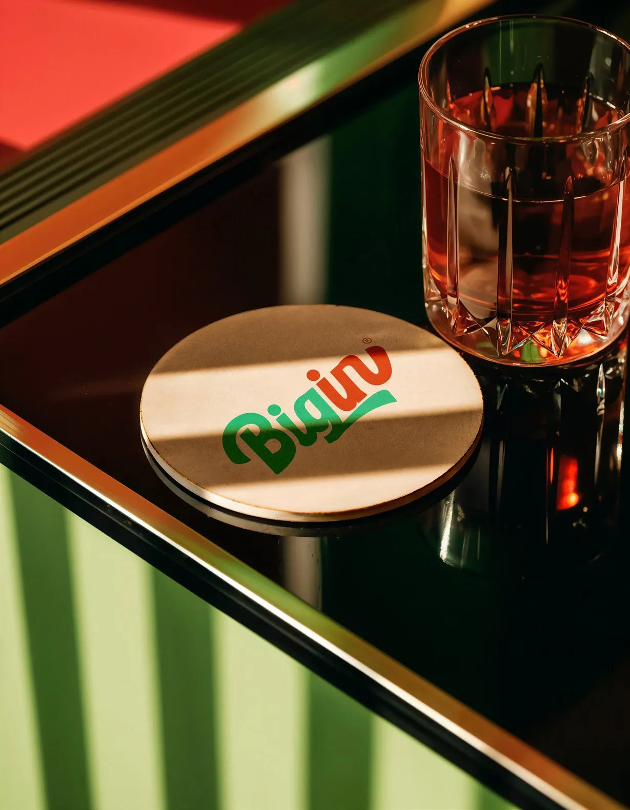
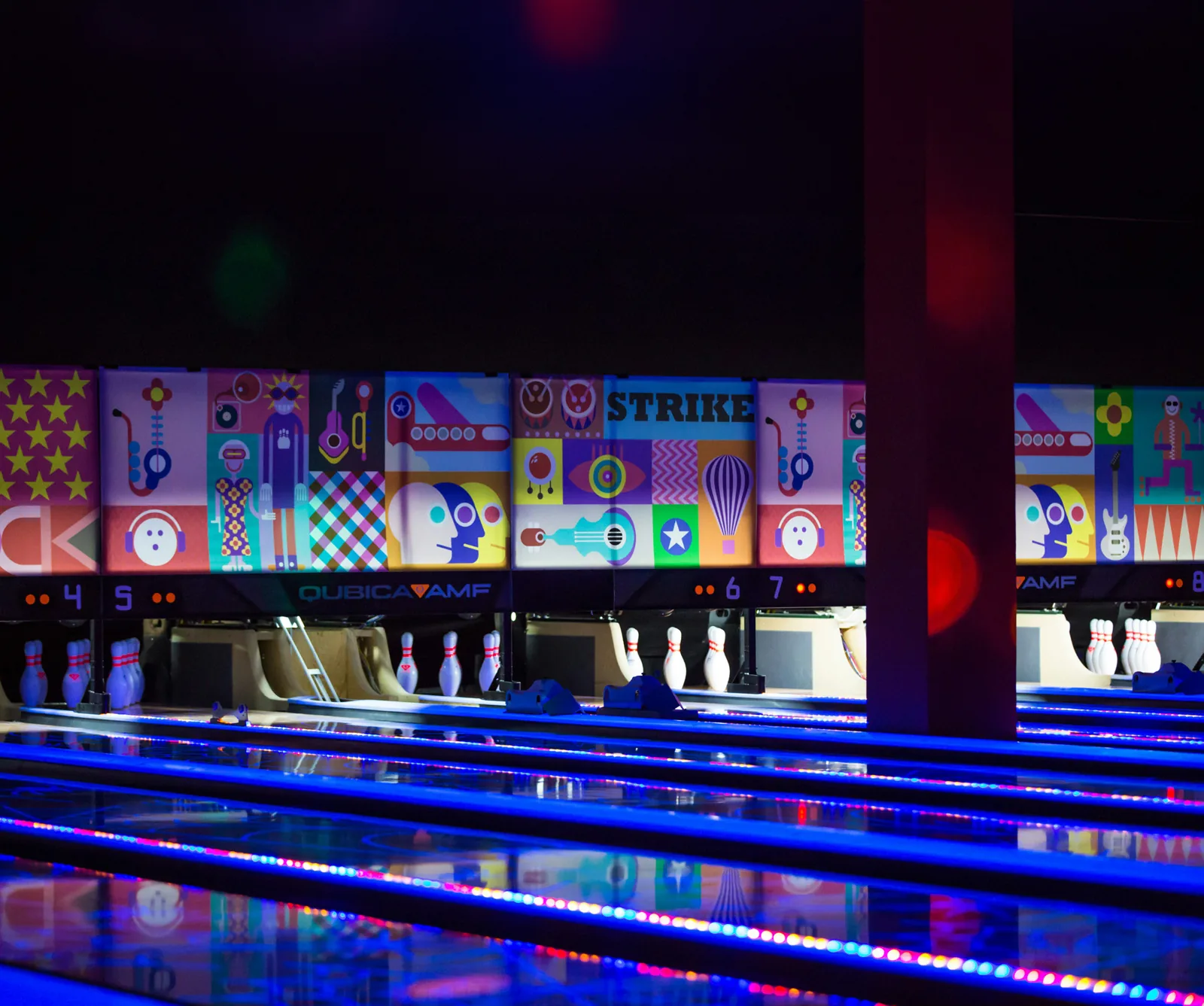
Big In is a premium social destination: retro arcade games, bowling, billiards, elevated dining and nights that run on energy. We built the brand from the inside out, starting with what the place should make people feel, then translating that into a voice, a system and a retro identity.
Challenge02 / 13
Not a place you go to.A place you belong to.
The risk with a venue like this is obvious: it becomes one more place to visit. The brief was the opposite, a place built for people who don’t follow the scene, they define it.
Somewhere time moves differently, people connect without effort, and every visit leaves a mark.
Concept03 / 13
Not a destination.A state of being.
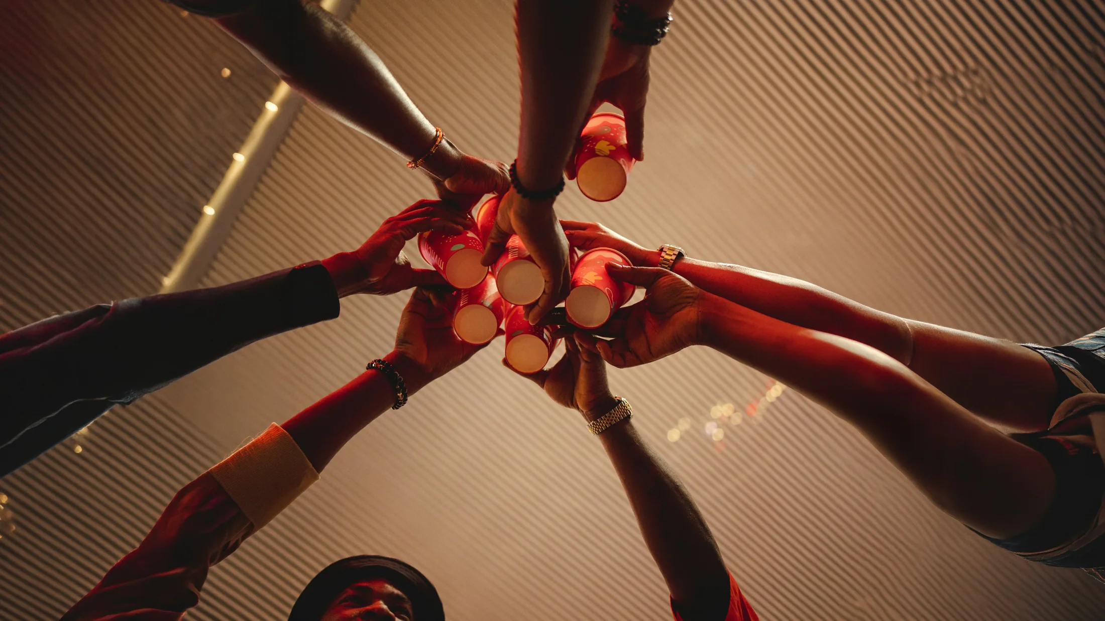
Built for a new generation of socially active, experience-driven people, Big In merges high-end leisure with high-energy rooms. People don’t come to spend time. They come to be seen, to feel, and to belong.
The philosophy fits in one line: if you’re here, you’re not just part of the scene. You are the scene.

Big In was never designed as a visual identity first. It was built as an emotional experience.
Every decision in the branding process started with one question:
What should this place make people feel?
From there, the identity evolved not through decoration, but through translation: energy into form, atmosphere into colour, and behaviour into visual language.
This is not just a brand you see…
It’s a brand you feel, moment after moment.

The retro American influence of the 70s–80s was not chosen for nostalgia alone, but for its raw, expressive character. A time where boldness, personality and presence were unapologetically visible: exactly what Big In stands for today.
The identity reflects a balance between contrast: playful yet controlled, bold yet refined, energetic yet structured.
Typography, colours and graphic elements were crafted to create rhythm, a visual flow that mirrors the experience inside the space. Nothing feels static, because Big In itself is never static.
Positioning04 / 13
Five pillars.One way to show up.
Not categories. Expressions of what it means to be Big In. Each one shapes the room, the menu, the service and the way the brand talks.
Positioning Framework
Big In is built on five core experiential pillars.
These are not categories, they are expressions of what it means to be Big In.
1
Big Time
Time at Big In isn’t spent, it’s amplified. Immersive, fast-paced and unforgettable: moments stretch, intensify and stay.
Tagline system05 / 13
Big [Expression].Big In.
One structure, five expressions. Every piece of communication picks the pillar it speaks for, and the line keeps the same shape everywhere: a cup, a wall, a reel or a receipt.
Big Time.
Big In.





Voice06 / 13
The brand doesn’t invite.It recognises.
Big In speaks to people as if they already belong, so the usual hospitality language had to go. The core idea is not a slogan, it is the base of every line.
| Avoid | Say |
|---|---|
| You already know why you’re here. | |
| Show up like you own it. | |
| The Big In crowd. |
Confident
never apologetic
Direct
never passive
Social
never distant
Elevated
never exaggerated
Energetic
never chaotic
Audience07 / 13
They don’t look for places.They look for a reflection.
Big In is for people aged 20 and over who value experience, presence and social identity. They choose places that say something about who they are.
The
Big In
crowd.
- 20+
- Socially active
- Experience-driven
- Financially comfortable
- Seeking premium rooms
- Status-aware
Logo08 / 13
A script with a swagger.Read in one glance.
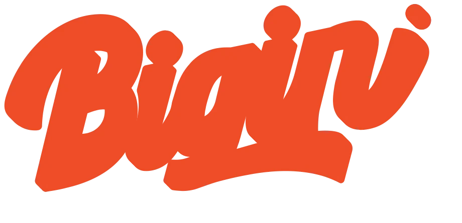
A hand-drawn retro script: green for Big, red for In, and a swash that underlines the whole name. The clear space is built from the tail of the g, and four alignment points line it up with type and imagery.
Master logotype · clear space x
Alignment points
White background
Coloured background
One colour · black
One colour · white


Colour09 / 13
Five retro colours.One ratio.
Retro Green leads, Retro Red answers, and Blue, Pink and Yellow keep the room loud. The ratio keeps it from turning into a carnival. Tap a colour to copy it.


Pressed on tape.
Mixed by the room.
The palette lives on cassettes, wraps and walls: one colour leads each piece, the others back it up.
Visual elements10 / 13
Stickers, not decoration.Go on, move them.
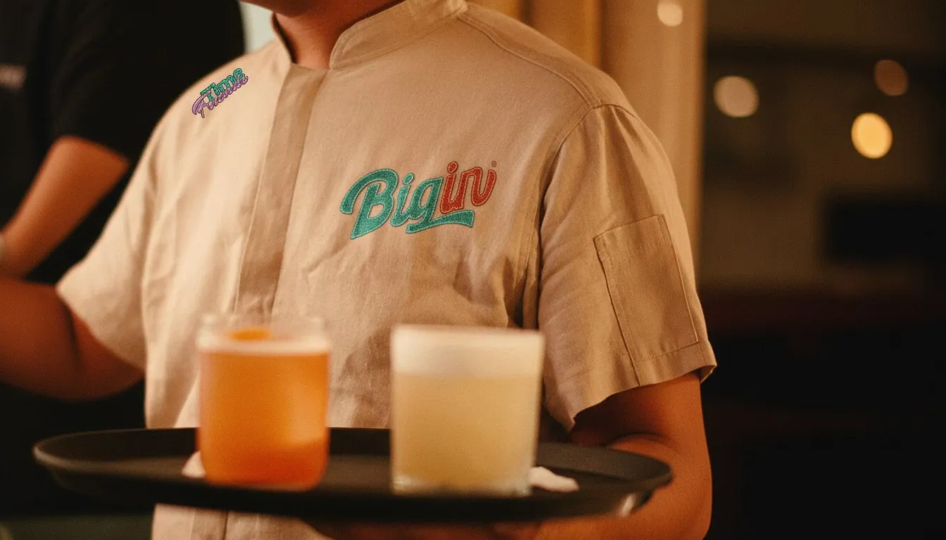
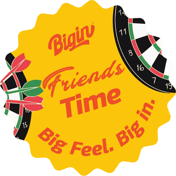
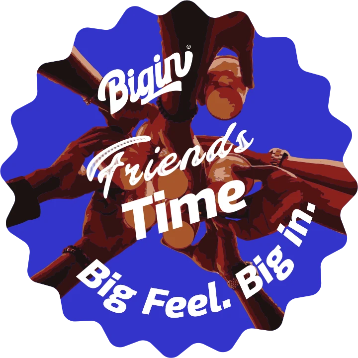
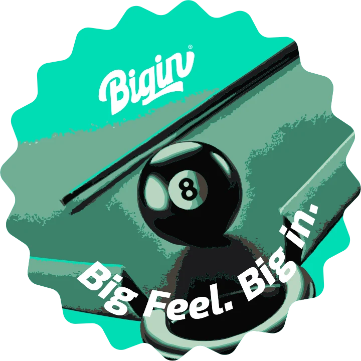
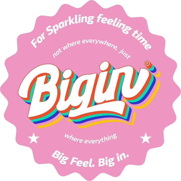
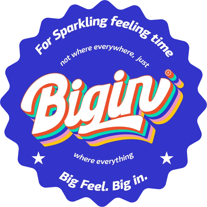
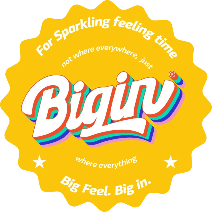
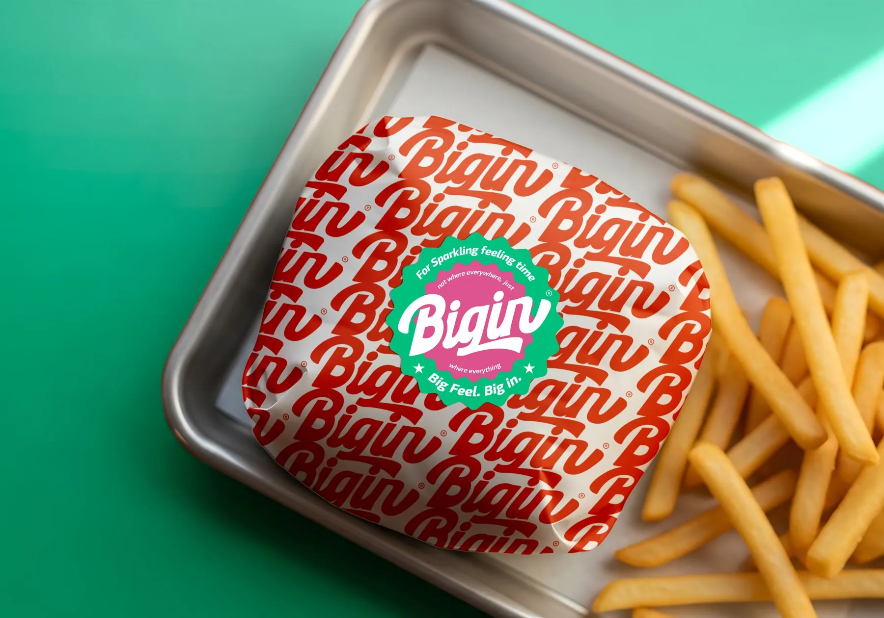
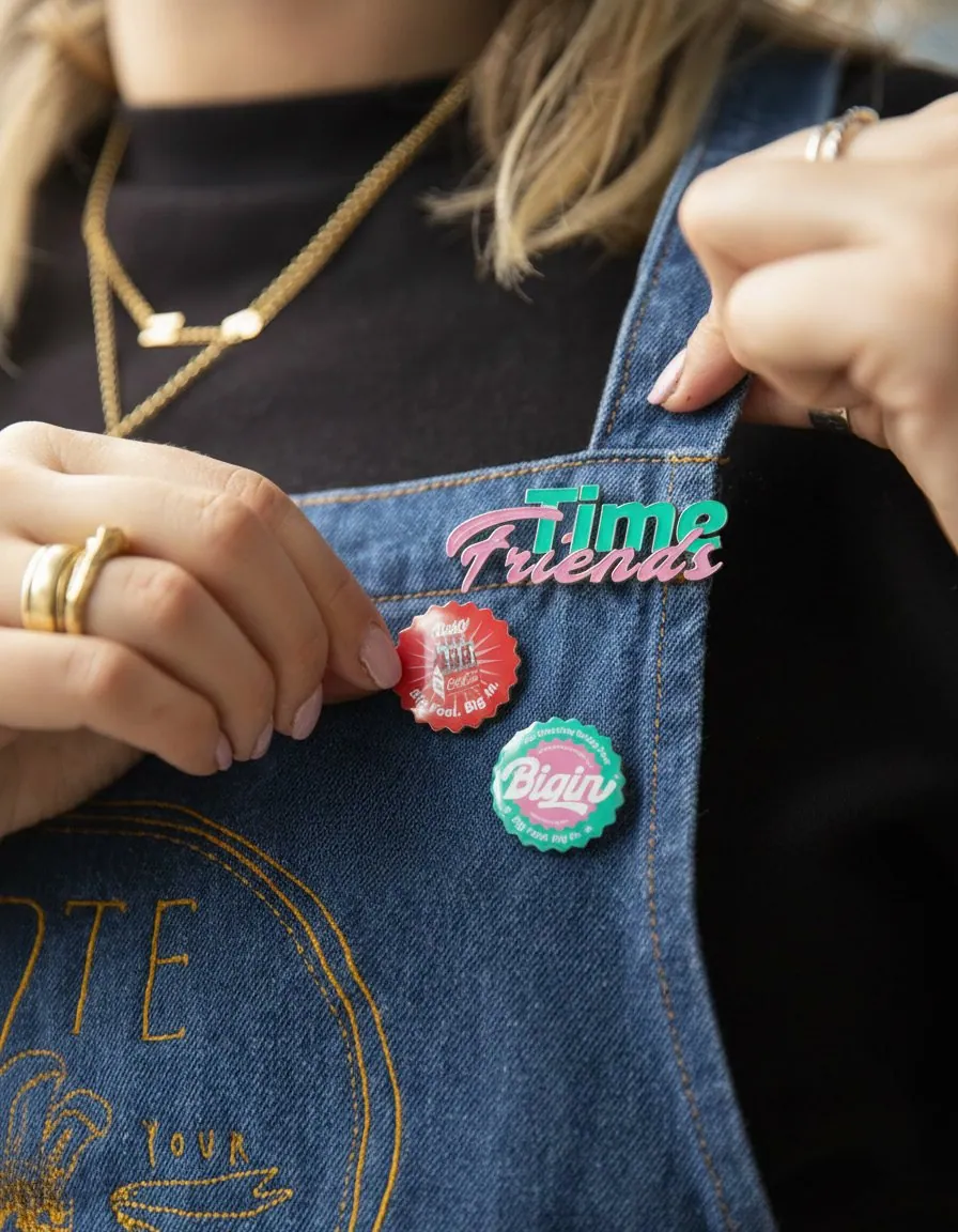
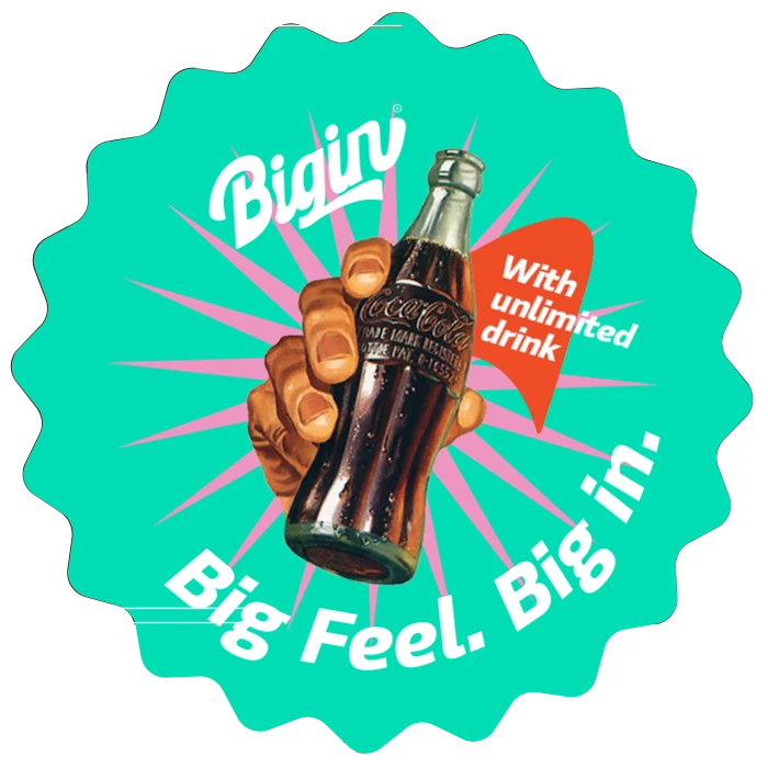
Scalloped badges carry the pillars: the eight ball, the strike, the float, the Friends Time darts. They land on cups, bags, aprons and walls, the way a crowd marks its place. On any layout they cover 80 to 85 percent of the design, never less.
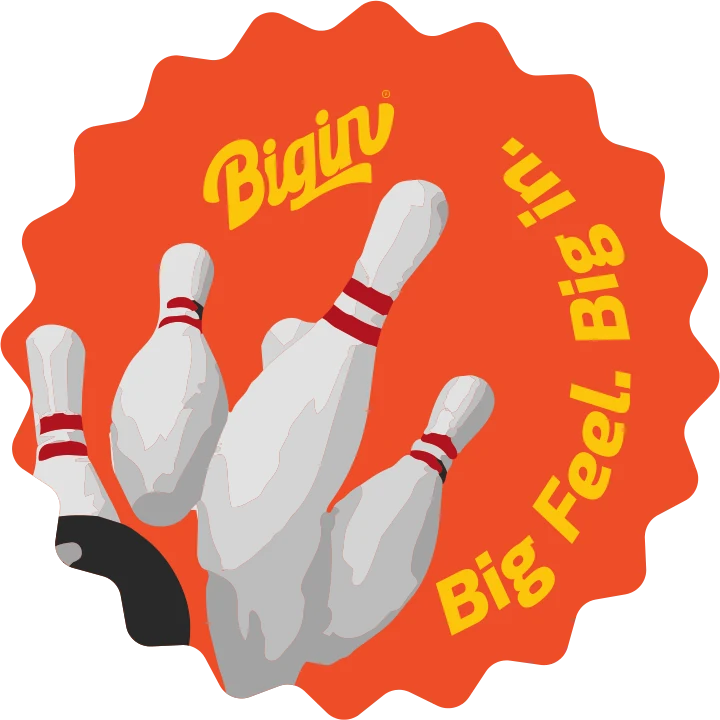
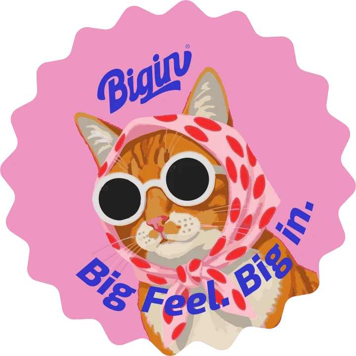
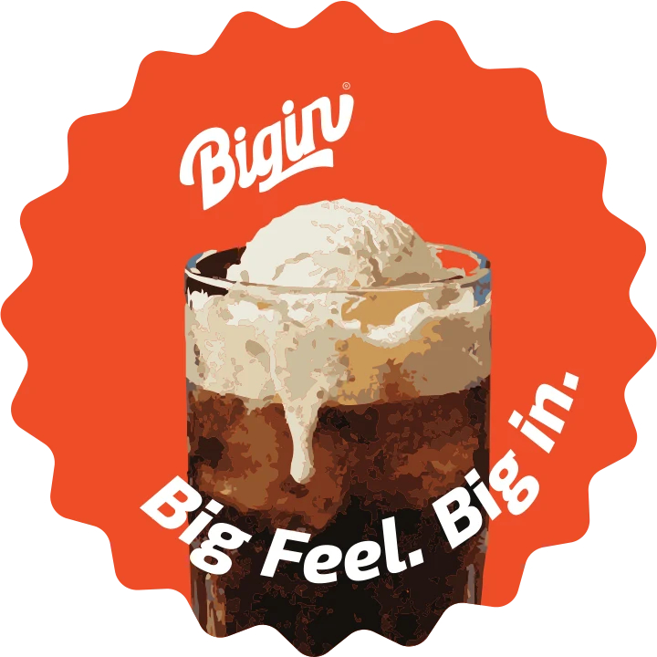
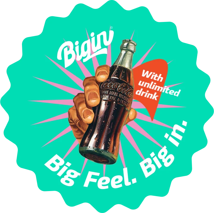
Stickers on, until the wall is covered
Coverage rule · 80–85%
For sparkling feeling time.
Not where everywhere,
just where everything.
The badge is the brand in one stamp: the promise around the edge, the logo at the centre.
Experience11 / 13
Four rooms.Never the same night twice.
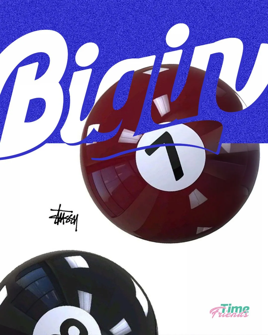
Play, dine, social and occasions each take a colour and a tone. The crowd stays the same.
Play
Step into a space where energy leads and competition follows.
In the world12 / 13
From the wrap.To the wall.
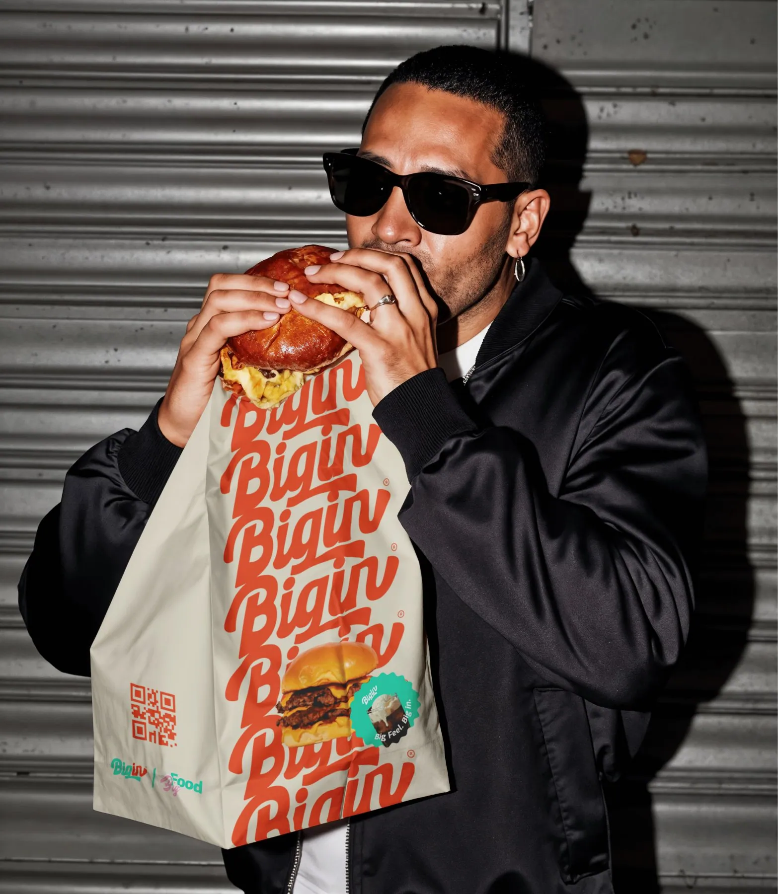
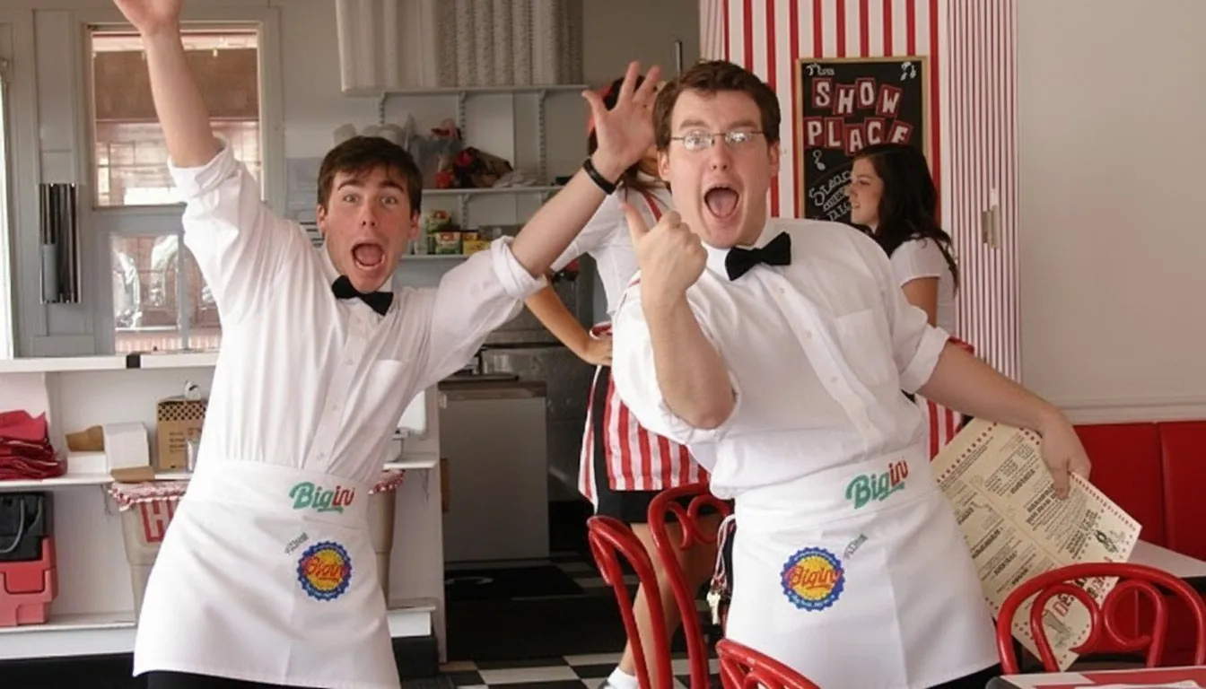
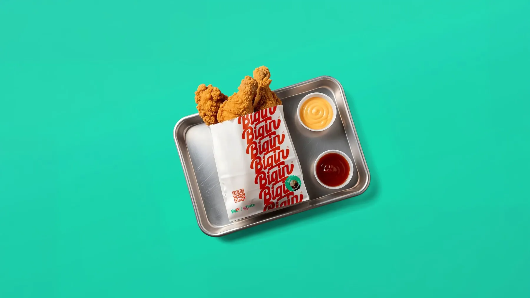
Packaging, uniforms, posters and merchandise run on one rule: the logo repeated until it becomes texture, stickers on top, one colour leading each piece.
Brand guideline · flip-through
01 / 61
Welcome to Big In.
Or better yet, welcome to being Big In.
Credits13 / 13
Big Feel. Big In.Mind for Rent.
Made at Dopamine Agency, by minds we rented out before 3B had a name. The work and its rights belong to Big In and Dopamine Agency; we show it with credit.
- Client
- Big In
- Made at
- Dopamine Agency
- Scope
- Strategy · Identity · Guideline
- Year
- 2026